image essay #15

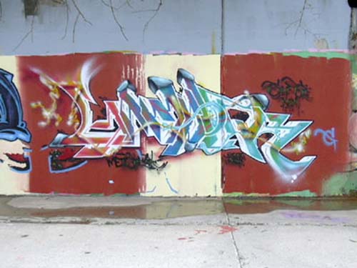
This piece by Gamble, compared to the last one illustrates his diversity in lettering. Some artist tend to grasp one form of lettering and stick with that form using different colors, but Gamble, as well as many other extremely diverse artists, are able to create new and inventive forms of lettering, or mimic existing forms. This piece’s color is more lively and the black outline almost makes the piece seems as if it’s popping out at you or like it is a cut out of sorts.
The way Gamble was able to pull the different colors through the piece by using line work is referred to as an industrial style. The sharp jagged lettering is also an extension of the industrial style, which is made to look like pipes and machinery that you might see in a factory or what have you. Unlike the other piece, Gamble used white and gave the letters depth so make them seem like they are alive almost, instead of just paint flat on a wall. The design in Gamble’s lettering is an excellent way to pull the view’s eye through out the piece, and back. There are little tails or things that seem as if they don’t belong, but Gamble was able to make it work through his color choice and what-not.


0 Comments:
Post a Comment
<< Home