Thursday, December 07, 2006

Extra Credit personal essay


I am trying to illustrate the idea that I am being weighed down by the creative things I would prefer to do instead of the things I am obligated to do, i.e. school work, finding a job, etc. I gave myself a stone texture to further stress the idea that I am unable to keep up with these obligations or that I am stuck between what I want to do and what I have to do. I’m reaching for the clock in a metaphorical attempt to give myself more time so I can focus on what I want to do as well as what I need to do i.e. practice guitar, make music, draw, read, etc. The Crow signifies the idea that my creativity is being neglected because, although it is what I want to do and it is what is on my mind, it isn’t getting enough attention because of other obligations. I am bending to my right because it is thought that the right side of the brain that holds one’s creativity. I chose to use a warm color scale to give a feeling of frustration with the situation. The design around the outside of the clock is actually taken from the shadow on the right side of my back, which I suppose could hold significance in someway, but really was just a way of giving the background a sort of texture and a minimal amount of depth. The situation of not being able to keep up with my obligations relates to Alice not being able to keep up with the white rabbit in the story, or how she is always a step behind.


*The birds on my back hold no significance to the piece; they are actual tattoos I have, although I got it to illustrate my personality, or how I hold the idea of freedom (not being restricted in anyway) above anything else. Or if I could be any animal I would be a bird because I am some what obsessed with the idea of flying. Flying free of mechanics, to me, would have to be the most peaceful thing one could ever experience.

Monday, November 27, 2006

image essay #15

This piece by Gamble, compared to the last one illustrates his diversity in lettering. Some artist tend to grasp one form of lettering and stick with that form using different colors, but Gamble, as well as many other extremely diverse artists, are able to create new and inventive forms of lettering, or mimic existing forms. This piece’s color is more lively and the black outline almost makes the piece seems as if it’s popping out at you or like it is a cut out of sorts.

The way Gamble was able to pull the different colors through the piece by using line work is referred to as an industrial style. The sharp jagged lettering is also an extension of the industrial style, which is made to look like pipes and machinery that you might see in a factory or what have you. Unlike the other piece, Gamble used white and gave the letters depth so make them seem like they are alive almost, instead of just paint flat on a wall. The design in Gamble’s lettering is an excellent way to pull the view’s eye through out the piece, and back. There are little tails or things that seem as if they don’t belong, but Gamble was able to make it work through his color choice and what-not.

image essay #14


Graffiti has always been my favorite form of artwork, simply because I personally find the media to be one of the hardest, if not the hardest form of media. I like the adrenalin you get as well as the mystery and pleasure. I feel as if street graffiti is the only form of art where you are doing art because you enjoy it, there is no need to make the piece presentable, and it’s nearly limitless as to where you can paint. Gamble is one of the best artists I have ever encountered. I believe he originates in Cincinnati, although I could be wrong. Gamble’s artwork is precise and all around creative. His chose of color is always what first catches my eye; he has a way of making it look so simple like anyone could do it. This piece is a simple two color piece, with the black lettering and the green outline. White is also used, but only as highlight, as it usually is. Graffiti is thought to be done mainly by those in gangs, although the majority of graffiti is actually done by people simply trying to create art or extend some sort of message, whether it be political or something else.

image essay #13


Picasso’s “The Old Guitarist” is an excellent example of mood and color. During Picasso’s blue period, Picasso used blue as the main color for all of his art work. He used blue because he was in a sad point of his life, and he was trying to portray this through his art work, by making the large extent of them shapes of blue. Not only is this piece an excellent example of mood through color, but it also allows your eye to move through the painting by the way he positioned the man and the guitar on the canvas. The man seems to be too large for the canvas; therefore he has to bend over, giving the viewer a sense of claustrophobia and confinement. It looks as if the man is hardly playing the guitar as if he is about to give up. Picasso could be trying to portray an idea of incompleteness like this musician never fully reached his dream, or the idea of a “starving artist” via music as an art form over paint or what such. I like the way he also did the lighting. The right side of the painting is mainly darker, or in the shadow, to further portray that feeling of loneliness or failure.

image essay #12


This piece by M. C. Escher is juxtaposed in a sense, because the leaves are arranged in a way that leads your eye around. While looking at the leaves you are then drawn to look beyond, which you will then see a coy fish under the water. The way Escher was able to create enough clarity in the water to see the fish and nothing else is neat because it makes you focus on that alone. This could mean the coy fish holds some sort of significance to either Escher or the message he it attempting to portray.

The reflection of the trees on the water plays a valid role in the piece as a whole. The leaves lead your eyes back into the piece while the reflection of the trees lead your eyes back down the piece to the fish. The leaves also give the piece a sense of depth and calmness, in that there are no ripples in the water. Escher could be trying to put you in a peaceful state of mind with the calm water and the peaceful coy fish. The grey scale color used also makes the piece seem calm and blissful. With all the leaves on the water and the leafless trees above, we can assume from the reflection, put you in a autumn of early winter setting as well.

image essay #11


M. C. Escher’s Relativity nearly explains itself. The illusion Escher was able to capture is mind boggling. At nearly every angle possible Escher was able to make it look as if the piece was supposed to be placed that way, when in actuality there is no was in which the piece can be placed that supports what is going on. Escher was the first to create this type of artwork. From this came numerous varieties of optical illusion pieces. Optical illusions are that of which works as a whole seem sane, but physically are impossible. They mislead the brain to comprehend what it thinks it should see, when in actuality it is physically impossible.

The lighting in this piece had to be extremely hard to create as well. Escher had to figure out a way to make the lighting seem as if it were coming from a variety of angles and places. He made the light come from the doorways, but he also put lighting on foreground objects so it seems as if there is light behind us as we are looking at it. the way he made the three main stair cases surround the center of the page keeps your eye moving throughout the pieces entirety. There is so much to look at because Escher took the time to include precise detail so you can look at it for hours and probably still miss something.

image essay #10


M. C. Escher’s Reptiles is one of my most favorite pieces. The idea he took from his tied designs and the way he was able to incorporate it into a full piece of art work is astonishing. Escher basically took an idea he had and made it come to life. Every time I look at this piece I get a feeling of reality, as if I could reach out and pick up one of these reptiles.

He made the right decision in not using color. With color the piece would have less focus on the liveliness he captured without color. Escher used the by standing, bottle, book, and plant as places for your eye to roll over. The was he only used part of the paper for the tied design lets the rest contrast other objects such as the books and the geometric shape with the reptiles on it. The dark contrast also lets the original design stand out more.

I am a big fan of M. C. Escher, I believe he has some of the most unique and outlandish pieces of art I have ever seen. Besides the tied design he has numerous illusive pieces that make you stair and think.

Tuesday, October 31, 2006

image essay #9


This is a piece by Brandon Boyd from the band Incubus. Brandon is more of a musician then an artist, but having listened to his music and following Incubus for a while now, I have become very intrigued by not only Brandon’s but also Jose’s art as well. Jose plays drums for Incubus, while Brandon does vocals and plays a little percussion along side of this.

I thought this piece was particularly interesting, because it’s very well balanced and there’s enough going on I find myself staring at it for a rather long time. I was moved by the way he chose to position the arms. And the way he positioned the feet, in that the one is up while the other is balancing the elephant. This simple black and white makes you focus more on the detail then anything else. When looking at the face closely you can notice an Aum or a Hindu symbol for a peaceful state of mind, serenity. I thought this was a clever way to further elaborate the meaning Brandon is trying to get across.

I am inspired by Incubus in so many aspects, not only music, but also art, philosophy, and motivation. I thought it only fair that I give one of his pieces of art some sort of gratitude.

Wednesday, October 25, 2006

Blog entry #5

1. How has this artist contributed to the field of study which you plan to enter?

He has taken an abnormal idea of the human figure and reality and manifested it on canvas.

2. What achievements or developments makes this person stand out in that field?

His original style of work and bizarre creations make him stand out.

3. What impressed you most about this artist?

His abstractive/realistic smooth style

4. How have they used dominance to organize or structure their work?

Every piece holds a style like another.

5. How do they address the human form?

In a very sway and flexible/stretchy form

6. In what ways have you been influenced after seeing their work?

To not make all of my art work so closely tied to one another and in stead make it seem as if multiple artists have created my work in stead of only me.

7. How does this artist use color? What color schemes or other mechanisms, such as emphasis or temperature, do they employ?

He uses a lot of cool on warm, or vise versa to differentiate the background from the main object(s)

image essay #8


Inka Essenhigh

This piece by Inka Essenhigh caught my attention because I couldn’t help but get the feeling of sheer comfort when looking at it. Inka did an amazing job capturing the feeling he was going for. The way he portrays the main character in lazy sleeping pants laying with pillows everywhere and on top of three mattresses that sink into a mattress or pillow type floor.

Inka was able to create an outstanding feeling of depth by the way he used more detail with larger objects in the foreground and faded the background to white. He was able to carry your eye throughout the piece’s entirety by using the pillows in the foreground that then lead your eyes up to the main object in the middle of the page. Although, the characters that are fanning the main character seems to be out of place. This could be because he was trying to portray some sort of guilty feeling for being such a sloth. Therefore he portrayed the fanners as demon type creatures instead of a more comfortable creature.

All and all I find this piece very inviting, and maybe that’s not necessarily a good thing. Being so comfortable could be a bad thing if you have other things to get accomplished. I would say that Inka’s idea when creating this piece was a little more on the lines of a blissful situation or feeling.

Monday, October 16, 2006

Blog entry #4

ART: 21 PLACE

1. I think we both define and are defined by the places we reside to some extent. Our surroundings take part in molding us so we can cope in such. But we also effect our environment by the way we take to it. A city can be a beautiful place because of all of the markings and mystery through and between its structures. Although a city can be disgusting if we neglect it’s cleanliness, in turn affecting us by making us ill.

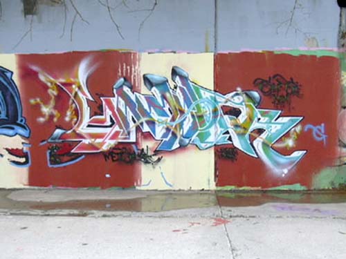
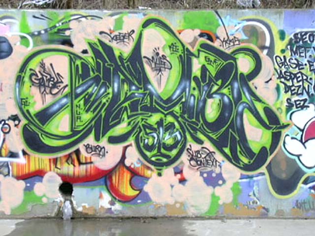
2. Sally Mann chose to live outside of any industrialized locations because she found them to be distracting and cruel to nature. In turn she was primitive in a sense. She aloud her children to roam as she once did, in the nude outside where she photoed them as such. She also found beauty in the landscapes she also photoed. Barry Mcgee resided in a city where he practiced graffiti and painted in buildings for money. Growing up in the city, Barry found art in lettering and abnormal characters.

3. I think art can be found through buildings, the writing on buildings and or nature it’s self. I’ve always thought this, the video just elaborated on my prior thoughts.

4. I would say I feel more effected by urban art, such as graffiti, because it involves art as well as adrenaline. I also feel as if more people will be able to see and enjoy the art that sits on building walls like billboards, only without advertisement.

5. I don’t really think I thoroughly understand this question. But I guess if you’re doing something such as graffiti you are probably working on a very large scale. If you are taking photos like Sally Mann you are working on a smaller scale, but with more composition with the sun light on landscapes and such. If you’re working like Richard Shard you are on an extremely large scale because you are illustrating the feeling of space through your work.

6. As a child I was, and probably still am semi-claustrophobic, small places made me feel uncomfortable, such as tight crowds. Therefore large crowds scared me. I liked to be in open areas, suck as on my roof at home or my back deck, I could call that comfortable. When I’m walking through crowds I like to have a hood on so I don’t have to look or talk to people, I call that my safe-haven. Driving in my car was also a place I liked to be to think, with an occasional cigarette and low music of course. I would call that my intellect place, I guess. When I was really young I would go to our local YMCA and play with all of my friends, that’s when I found out I didn’t take to sports very well. So I guess I could call that annoying, because I never really liked to hang out there, I just wanted something to do and be “cool.”

7. I pick my car. The lighting was of an evening light, maybe on a Friday before I was getting drunk and making bad decisions. I liked the feeling of the window down with air calmly blowing through the car. I also would have to mention the sound, because I was either listening to loud obnoxious music, quiet mellow music or nothing at all. It just depended on how I was feeling at that certain point and time.


ART: 21 STORIES

1. I think the most important stories of today aren’t that of known truth, but that of the future, via ideas, beliefs and the outcomes where we are and what we’re doing. Change, because I believe what we’re doing and were we’re going is not good. If I were to pass down a story I would pass down my idea that competition is not health and fucks with peoples heads to much which eventually leads to the harm and death of innocent bystanders. Look at what we’re doing, we’re power hungry and we’re killing people because of it. The story of how it’s too late for salvation. How we’re a massive virus on one of God’s cells and the Idea that life isn’t based on anything but a circle, no species is special or better then another. We’re all a part of a circle, a circle we are cutting in two. It’s drastic, but that’s my story.

2. Some stories hold entertainment… death, gore, drama, etc. Stories as such entertain us because we’re fucked up. Simple, but true. I would elaborate on why I think this way, but I would only be getting off subject and it should be apparent from the first question anyway.

3. They document stories that they find interesting or that hold some sort of compassion to their lives. Stories they feel need to be taught, or told to aware the naive.

4. Growing up I was probably pretty normal to everyone, but that’s only because I molded to people so I had no enemies. I was a jock, a hick, a rocker, a druggy, an artist, a partier, a graffiti artist, a writer, popular, cool, good-looking, trendy, smart… ish, middle class, low class, high class, black, white, green, red, blue, an intellectual, kind, caring, rude, polite, cruel, two-faced, you name it I was or could be it. It’s easy really, all you have to do is agree with people, and do what they do. That was me in a nutshell, although I am starting to mold myself now that I have people I can relate to near and around me in college, I’m even starting to enjoy the company of my parents. But I’m getting off subject. On my own I was very intellectual and probably bi-polar. I wanted love, but I didn’t want a relationship, I wanted sex, but I got too attached and I hated the after math of those situations, so I wasn’t a stud. I was shy to people I didn’t know, I thought about suicide a lot, but that’s only because I was so confused and I wanted to belong everywhere and no where at the same time. I always loved my parents, but I hated their religion, Catholicism. My mom tried to base how she raised us on Catholicism and all it did was make me hate religion. I was… and still am lazy, I use the excuse that being taught something ruins originality, when in actuality I’m starting to realize, it’s just me being lazy. I now hate working, because I’m lazy. Money pisses me off; I don’t think it should exist. I know you need it, but I would rather choose to be broke and mooch off my loving parents and summer income until I’m out of college. Growing up I always thought I was the mature one, when, now that I think about it, I was actually the immature one with an extremely lazy attitude making it hard for me to get anything done, because I would just convince myself my beliefs were against it. Again, now I’m starting to come around and I’m starting to realize life sucks, but I’m not the only one living it and I should stop pitying myself.

Tuesday, October 10, 2006

image essay #7


Inka Essenhigh – They came from the sea

I like the simplicity in this painting and the value. This is a painting by Inka Essenhigh which he titled “They Came from the Sea.” I thought this piece to be different from this normal work in that there are no figures of any kind. The piece has a strict grey value scale which does a good job with keeping your attention on the form rather then the color, being that there is no color. The way Inka uses value give the painting a variety of textures and places for your eyes to wonder about. “They Came From the Sea” in assumption probably came after the piece had been made. When looking at the piece I notice that it does look like rocks or something is rising out of a body of water. The extreme value used by Inka with the pure whites and pure blacks help guide the viewers’ eye throughout its entirety. There is also what looks like a bird-type figure in the background, which establishes depth and movement. The lightness of the upper area, to me, portrays a sky while the foggy light grayish area in the right could portray clouds. I believe this is one of his better pieces because it is more unique to his normal style of work.

Tuesday, September 26, 2006

image essay #6


This piece by Inka Essenhigh caught my eye, because I like the way he illustrated solar radiation. The Simplicity of the color scale makes you focus more on the rays and the way they are molding to the people on the picture. Although I can’t see much because it’s an internet piece and it’s hard to make out exactly what is going on in the back ground, I think it’s safe to say that there are some subordinate figures that aid your eye to move throughout the painting.

I like Inka’s style of painting. I find the figures to be very loosely illustrated and the way he makes the rays look like they are melting on the people and ground is very original and risky. I think Inka did a great job in catching the feeling of sun bathing. Just looking at this painting makes me feel warm, even hot if I look long enough. The figures in the background also give the painting depth, although I think there could be more done about the depth. The value is well done also, in that the higher contrast stands in the front of the piece while that of lesser contrast is rendered in the back.

image essay #3

Kenneth Noland's Painting titled "Indigo" illustrates a pattern in that the circles grow out from the center. The pattern is then stopped because they rings don’t go out to or over the edges of the canvas. This painting is also a good example of radial symmetry, because the painting is mirrored both horizontal and vertical.

I believe the main point of Kenneth Noland’s artwork is to catch the viewer’s attention with color more-so then design. The majority of Noland’s works include circles a lot like this with bright vibrant color schemes. Noland also has a series of chevron designs, and I believe an abstract series that closely follows his over all idea of color as well.

Noland Uses a Strict Blue scale color scheme. The use of one color in this fashion is a good way to keep simplicity and not over due the piece in any extremities. The precision and symmetry of the circles keeps the colors the main point of attention. The piece holds a certain simplicity that makes it very unusual as well, along with the one color scheme. The piece is also cut into a square that is directly proportional to the center of the piece it’s self.