Tuesday, September 26, 2006

image essay #6


This piece by Inka Essenhigh caught my eye, because I like the way he illustrated solar radiation. The Simplicity of the color scale makes you focus more on the rays and the way they are molding to the people on the picture. Although I can’t see much because it’s an internet piece and it’s hard to make out exactly what is going on in the back ground, I think it’s safe to say that there are some subordinate figures that aid your eye to move throughout the painting.

I like Inka’s style of painting. I find the figures to be very loosely illustrated and the way he makes the rays look like they are melting on the people and ground is very original and risky. I think Inka did a great job in catching the feeling of sun bathing. Just looking at this painting makes me feel warm, even hot if I look long enough. The figures in the background also give the painting depth, although I think there could be more done about the depth. The value is well done also, in that the higher contrast stands in the front of the piece while that of lesser contrast is rendered in the back.
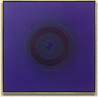
image essay #3

Kenneth Noland's Painting titled "Indigo" illustrates a pattern in that the circles grow out from the center. The pattern is then stopped because they rings don’t go out to or over the edges of the canvas. This painting is also a good example of radial symmetry, because the painting is mirrored both horizontal and vertical.

I believe the main point of Kenneth Noland’s artwork is to catch the viewer’s attention with color more-so then design. The majority of Noland’s works include circles a lot like this with bright vibrant color schemes. Noland also has a series of chevron designs, and I believe an abstract series that closely follows his over all idea of color as well.

Noland Uses a Strict Blue scale color scheme. The use of one color in this fashion is a good way to keep simplicity and not over due the piece in any extremities. The precision and symmetry of the circles keeps the colors the main point of attention. The piece holds a certain simplicity that makes it very unusual as well, along with the one color scheme. The piece is also cut into a square that is directly proportional to the center of the piece it’s self.

Monday, September 18, 2006

Blog entry #3

1. Before this Blog Assignment, had you ever kept a journal, diary, or blog?
Yes

2. Before this Blog Assignment, had you ever written about art before?
A few times

3. Have you ever written for fun (poetry, fiction or non, journalistic, or research)?
Extensively

4. When writing, do you use a dictionary or thesaurus?
Both

5. If given a chance, would you rather discuss art verbally or through written means?
Either’s fine I suppose. Mainly based on my mood.

6. How would you rate your overall vocabulary?
Average

7. How would you rate your vocabulary of art terminology?
Average

8. How would you rate your writing abilities?
I’ve been told I’m not too bad, but I don’t know if that’s out of courtesy or what.

9. How would you rate your writing abilities when writing about art?
Insecure

10. How would you rate your ability to use specific vocabulary when writing?
I have no idea.

Monday, September 11, 2006

image essay #5


This Image by Douglas Marlone Illustrates proximity. The limited space that lays between the two figures is proximity. The painting also carries your eye around the canvas because of the way Marlone used the dark background, dark brown cloaks, and the shadows on the ground and figures.

I feel Marlone caught the human figure extremely well. The lighting on the piece is focused in the center creating a dark outside and background. The light extremities are very important in this piece, because of its simplicity.

The Canvas is vertically balanced very well. The figure on the right is displaying a lot more skin but has her head turned away from the viewer. The figure on the left is showing less skin, but has her face towards us which creates a balance between the two figures. The shadow under the right figure also does a good job at creating a good balance.

This image could be showing a difference in personalities, or a feud between two people. It could also be illustrating a difference in class, socially. The two women in the picture might have some sort of darker tie to the artist himself, making it an inner feud he is facing between these two women, social class, difference, etc.


image essay #4

This piece by Christophe Vacher illustrates extreme drama. The Main object in the front is obviously the point of focus, but the smaller object in the background gives the piece depth and movement. Movement is also illustrated through the clouds. The black foreground color illustrates movement as is fades lighter and eventually to the tan-white and then maroon at the top.

This piece leaves you with a very little idea of what the artist is trying to illustrate. I believe the piece hold little or no meaning, and that the artist was only trying to create an eye pleasing piece. It could also maybe have something to do with growth and knowledge in that the smaller structure in the back could be your past and that larger structure in that front could be you as you are now. At all times you were/are free spirited. The smaller versus the large structure could demonstrate what you should keep as important, meaning you should focus on the present time or the future, while keeping the past in memory.

My eye tends to start at the dark green in the foreground, and then moves back to the lighter green. From the lighter green in the background my eye moves up to the tan/orange and finally to the red, while on this path I notice the large structure in the foreground and eventually the smaller structure in near the top right hand corner.

image essay #2


Banksy is a graffiti artist, but is defiantly not your average vandalistic, as some would say. Banksy’s work is both beautiful and meaningful. The European artist’s work can’t be found in your normal art gallery, well most of the time. His art work illustrates political views and corporate hate. He relays messages of monopoly, greed, selfishness, carelessness, and so much more. His main subject matter is, assumingly, spray paint and pre constructed stencils.

The piece above, in guessing, could illustrate the idea that Wal-mart is responsible for the fall or death of many smaller corporations. The yellow smiley face is Wal-mart’s symbol cloaked in a reaper’s dress.

This along with many others symbolizes his view of a corporation or political issue. The piece could also show that Wal-mart is killing the small business world, because it offers nearly everything you could ever need in one store and because it has so many locations around the world.

Stencil art is created by first making a stencil using a plastic or heavy paper backing in which you cut out a design. The cut out design is then used as a stencil and sprayed. The areas in which had been prior cut out allow for paint to adhere to the thing you are painting, which creates your design.

image essay #1

Ralph Steadman's "Midget Bad Craziness" is extremely dynamic . it is this because the characters in the print are all facing off of the page to the right. this gives the print a sense of motion, although the characters have enough detail and excitment to keep your eye moving through the picture. the way the characters are illustrated is a huge risk, that in my opinion worked out for the best.

the artist's objective was to illustrate a sense of "craziness." with his splattered ink and his unusual characters Ralph did an amazing job creating a sense of creativity. his use of negative and positive space sinks your eye into the paper. the detail also keeps you looking at the piece of art.


Ralph Steadman works with the writer Hunter S. Thompson in gonzo journalism. all of the calligraphy in the movies Fear and Loathing in Las Vegas and Where the Buffalo Roam was done by Ralph. for the record i think these entrees should be 100 words... not 200, just for the record, but of coarse I’m not the teacher so it's not my decision. I still think this is under 200 words... and still, but wait… not anymore.