Monday, November 27, 2006

image essay #15

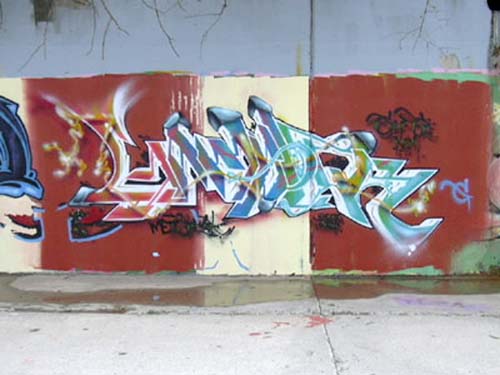
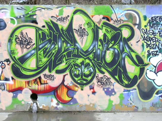
This piece by Gamble, compared to the last one illustrates his diversity in lettering. Some artist tend to grasp one form of lettering and stick with that form using different colors, but Gamble, as well as many other extremely diverse artists, are able to create new and inventive forms of lettering, or mimic existing forms. This piece’s color is more lively and the black outline almost makes the piece seems as if it’s popping out at you or like it is a cut out of sorts.

The way Gamble was able to pull the different colors through the piece by using line work is referred to as an industrial style. The sharp jagged lettering is also an extension of the industrial style, which is made to look like pipes and machinery that you might see in a factory or what have you. Unlike the other piece, Gamble used white and gave the letters depth so make them seem like they are alive almost, instead of just paint flat on a wall. The design in Gamble’s lettering is an excellent way to pull the view’s eye through out the piece, and back. There are little tails or things that seem as if they don’t belong, but Gamble was able to make it work through his color choice and what-not.

image essay #14


Graffiti has always been my favorite form of artwork, simply because I personally find the media to be one of the hardest, if not the hardest form of media. I like the adrenalin you get as well as the mystery and pleasure. I feel as if street graffiti is the only form of art where you are doing art because you enjoy it, there is no need to make the piece presentable, and it’s nearly limitless as to where you can paint. Gamble is one of the best artists I have ever encountered. I believe he originates in Cincinnati, although I could be wrong. Gamble’s artwork is precise and all around creative. His chose of color is always what first catches my eye; he has a way of making it look so simple like anyone could do it. This piece is a simple two color piece, with the black lettering and the green outline. White is also used, but only as highlight, as it usually is. Graffiti is thought to be done mainly by those in gangs, although the majority of graffiti is actually done by people simply trying to create art or extend some sort of message, whether it be political or something else.

image essay #13


Picasso’s “The Old Guitarist” is an excellent example of mood and color. During Picasso’s blue period, Picasso used blue as the main color for all of his art work. He used blue because he was in a sad point of his life, and he was trying to portray this through his art work, by making the large extent of them shapes of blue. Not only is this piece an excellent example of mood through color, but it also allows your eye to move through the painting by the way he positioned the man and the guitar on the canvas. The man seems to be too large for the canvas; therefore he has to bend over, giving the viewer a sense of claustrophobia and confinement. It looks as if the man is hardly playing the guitar as if he is about to give up. Picasso could be trying to portray an idea of incompleteness like this musician never fully reached his dream, or the idea of a “starving artist” via music as an art form over paint or what such. I like the way he also did the lighting. The right side of the painting is mainly darker, or in the shadow, to further portray that feeling of loneliness or failure.

image essay #12


This piece by M. C. Escher is juxtaposed in a sense, because the leaves are arranged in a way that leads your eye around. While looking at the leaves you are then drawn to look beyond, which you will then see a coy fish under the water. The way Escher was able to create enough clarity in the water to see the fish and nothing else is neat because it makes you focus on that alone. This could mean the coy fish holds some sort of significance to either Escher or the message he it attempting to portray.

The reflection of the trees on the water plays a valid role in the piece as a whole. The leaves lead your eyes back into the piece while the reflection of the trees lead your eyes back down the piece to the fish. The leaves also give the piece a sense of depth and calmness, in that there are no ripples in the water. Escher could be trying to put you in a peaceful state of mind with the calm water and the peaceful coy fish. The grey scale color used also makes the piece seem calm and blissful. With all the leaves on the water and the leafless trees above, we can assume from the reflection, put you in a autumn of early winter setting as well.

image essay #11


M. C. Escher’s Relativity nearly explains itself. The illusion Escher was able to capture is mind boggling. At nearly every angle possible Escher was able to make it look as if the piece was supposed to be placed that way, when in actuality there is no was in which the piece can be placed that supports what is going on. Escher was the first to create this type of artwork. From this came numerous varieties of optical illusion pieces. Optical illusions are that of which works as a whole seem sane, but physically are impossible. They mislead the brain to comprehend what it thinks it should see, when in actuality it is physically impossible.

The lighting in this piece had to be extremely hard to create as well. Escher had to figure out a way to make the lighting seem as if it were coming from a variety of angles and places. He made the light come from the doorways, but he also put lighting on foreground objects so it seems as if there is light behind us as we are looking at it. the way he made the three main stair cases surround the center of the page keeps your eye moving throughout the pieces entirety. There is so much to look at because Escher took the time to include precise detail so you can look at it for hours and probably still miss something.

image essay #10


M. C. Escher’s Reptiles is one of my most favorite pieces. The idea he took from his tied designs and the way he was able to incorporate it into a full piece of art work is astonishing. Escher basically took an idea he had and made it come to life. Every time I look at this piece I get a feeling of reality, as if I could reach out and pick up one of these reptiles.

He made the right decision in not using color. With color the piece would have less focus on the liveliness he captured without color. Escher used the by standing, bottle, book, and plant as places for your eye to roll over. The was he only used part of the paper for the tied design lets the rest contrast other objects such as the books and the geometric shape with the reptiles on it. The dark contrast also lets the original design stand out more.

I am a big fan of M. C. Escher, I believe he has some of the most unique and outlandish pieces of art I have ever seen. Besides the tied design he has numerous illusive pieces that make you stair and think.